MIAD: REAGAN FLAG

|
SOMOS UNIDOS
Size: 20.32 cm X 27.94 cm Medium: colored pencils on drawing paper Completion: April 2019 My flag was created as an idea for Ronald Reagan to use as their own. This flag shows school pride, strong friendships, caring students, and a helpful community. Ronald Reagan's husky logo, MPS's logo, and IB's logo were all inspirations to my flag's hues, lines, and symbol choices. |
If button does not work my email is [email protected]
INSPIRATION
|
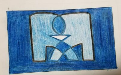
International Baccalaureate logo
|
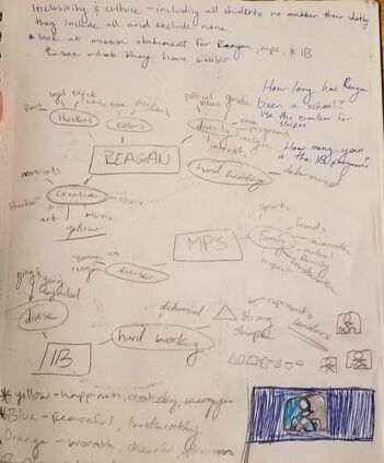
My first idea was to look up the mission statements of International Baccalaureate, Ronald Reagan HS, and MPS. Although I could not find the mission statement for Ronald Reagan HS, I was able to get a good idea of the purpose of IB and MPS. I had also found the amount of Learner Profile traits, ATL skills, and Global Contexts there are. All three of those concepts are a key part to the IB program and Ronald Reagan. Since the importance of those concepts are so strong I made sure to add them into my sketches as much as possible. IB MISSION STATEMENT: The International Baccalaureate aims to develop inquiring, knowledgeable and caring young people who help to create a better and more peaceful world through intercultural understanding and respect.
|
|
After going to Ronald Reagan HS for almost three years now, I can see the type of society that is present. Reagan Students are very creative and outgoing, they also are very proud to be a husky. When I went to our school website I was able to see our accomplishments and pictures from past events. Everyone is always seeming to have a fun time. As I am close to finishing high school I had many experiences with different people. Our students are very smart and to them it doesn't really matter their age group of friends. Many of us are feel comfortable going to anyone for help and know that there is always someone they can talk to. Since the international baccalaureate program and Ronald Reagan use the same colors I planned to use blues in my flag. |
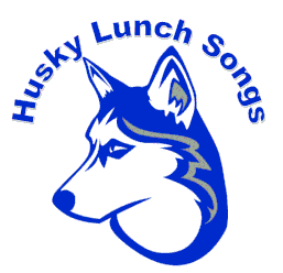
Reagan IB High School logo
|
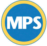
Milwaukee Public School logo
|
I wanted my flag to incorporate MPS as well but I did not think it would be appropriate to add the yellow color to my flag, since that is not a Reagan color. I went to the MPS website to find the mission statement to get an idea of the purpose, then I could maybe think of symbols to use in my flag. MPS MISSION STATEMENT: Milwaukee Public Schools is a diverse district that welcomes all students, preparing them for success in higher education, post-educational opportunities, work and citizenship. While I was looking for the mission statement I found another logo that MPS prefers people to use. The black and white colors seemed perfect to incorporate into my flag. Many people do not know this is also the MPS symbol which makes it different. Reagan is always trying to break a norm so if I included the black and white colors it will symbolize MPS and incorporate the reflection of Reagan.
|
PLANNING
|
After a little research I made three different mind maps. One was of Reagan HS, I branched off words that came to mind when I thought about the school. Some of the words were: huskies, hard working, diversity, creative, and trust worthy. After I came up with these words I branched off of those and wrote ideas on why Reagan is those words. For example I branched off political views, ethnicity, and interests from diversity. I continued this style of mind mapping for MPS and International Baccalaureate. Once I finished I started to notice that there were many of the same words repeated, like: hard working, diverse, loyal, family, and dedicated. I then took the repeated words and started to think of symbols that represented each word. The first symbol I thought to use was a triangle because it is the strongest shape and that can represent hard working and dedicated learners. After a while I got a stuck thinking of so many symbols for each word, so I started to think of colors. I thought that orange would be a good color to use to represent the students since orange symbolizes creativity and determination. This gave the idea to make an orange triangle to show that the students are dedicated to their work. I continued to find as many different shapes and colors I could use in my planning sketches before I even sketch my first flag.
|
|
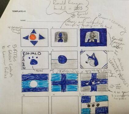
My first flag sketch had good intent with using the meaning of hues into my flag, but I did not like how it was not the school colors of Reagan HS. Although I did not like the color choice of my first sketch I liked the idea of incorporating the Global context into the flag. They were represented by the triangles since it is a strong part of the IB program. I felt like the sketch looked too boring and I wanted to become more abstract with he flag and give a more refreshed thought to the audience. The next two flags are both the same idea but experimented with different hues. This flag is one that I continued to explore further in my process. The two flags that are in the second row, in the first and second column, I did not like. These flags were too blunt and seemed like there was not enough thought put into it. I wanted my flag to be looked at and have to think about it more, I wanted everything to have a symbol. Instead of just writing the school name out or drawing the school mascot. I took the ideas off of those two flags and mixed them into my final sketch, I made sure that everything was a symbol and not obvious to the audience. I really experimented with the last flag sketch, as you can tell the last three are all the same idea but different images added each time. This is also a flag I continued with and enjoyed creating and expanding off of the images.
|
|
After looking at this sketch I like the precision of the person and the 'R's, but I did not like how it was slightly too high from the center. I was planning to experiment with this flag more by changing the solid royal blue to a grey or navy blue, when I do that I will make sure to use a ruler so I can truly see how the flag would look as a final product.
|
Ronald Reagan HS always incorporates the International Baccalaureate Program into all of our work, so I decided the flag should incorporate IB too. The two 'R's in the middle represent the first letter of Ronald and Reagan. I reflected the letters because reflective is one of the 10 IB Learner Profiles. By reflecting the two letters they create a person in the middle. This person represents not just our school community but the MPS community as a whole. All MPS schools are always caring for each other and supportive during times in need. No matter if one school is on the north side and the other is on the south side, we stick up for each other and have built a strong family community in the students. This idea is represented in the values of the 'R's. One 'R' is darker and the other is lighter, but when they mix they become the same hue. The arms on the person is a white upside down triangle because, although Reagan HS is named after a male figure, the female in Ronald Reagan have made many incredible marks in Reagan HS history. From being the largest female wrestling team in Wisconsin, to having multiple females becoming valedictorian. The solid blue in the background would be a royal blue to represent Reagan's school colors. The royal blue would be a beautiful contrast on a bright sunny day, against the sun, making the flag stand out in the sky. Although the solid royal blue is Reagan HS, the caring and being loyal towards the MPS community is also Reagan HS. The black bordering on the letters represent that Reagan HS is stronger when they have a well working community rather than working alone as a school.
|
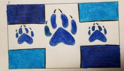
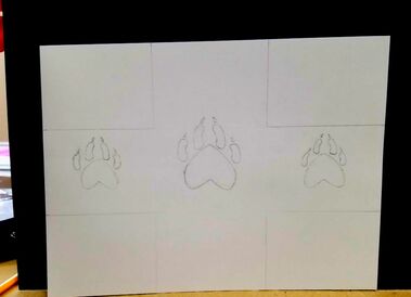
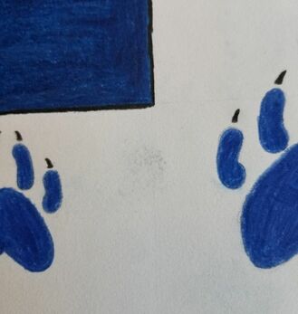
This flag is very aesthetically pleasing to the audience because of the straight lines and the solid hues. Although, the middle paw print it is slightly off centered to the left too much, and on its right toe it is a slightly different hue. Next time I will make sure to use a ruler to place my measurements and make sure to test the colored pencils on a different sheet of paper first to make sure it is the color I need. Also, have the two paw prints on the left and right to face different directions to make the idea of taking different paths stronger, rather than all the paw prints facing the same direction.
|
One of the biggest things that brings Reagan HS together is our school spirit. As a school we are very enthusiastic and excited for each new school year. Blue is a symbol of trust, wisdom, and loyalty, which is a perfect way to explain a Reagan HS student and why the paw prints are blue. The paw prints represent our school pride but also our intelligence. Reagan HS offers three International Baccalaureate programs as a junior and senior. You can pick between the Diploma Program, the Career Program, or the Course Certificate Program. Reagan staff encourage students to join the Diploma Program because it is know to help prepare for the work load and independence of college. Since that program is highly encouraged I made the paw print in the middle represent the Diploma Program. While the other two programs are encouraged as while, they are more projected based than being independent. Each rectangle in the corners represents a year of high school. The darker blues are junior and senior year. Dark blue symbolizes expertise and as an upper clansman the students become more knowledgeable and start to become the "experts" of high school. The lighter blues are the sophomores and freshmen. Blue is a hue the symbolizes calmness and although the underclassman may be scared of entering high school, they keep the school fresh. The underclassmen subconsciously help the upperclassmen be reminded that everything will be okay. I decided not to put the colors in order of grade level, but have them opposite because the students at Reagan are open to having a diverse set of friends. Although sometimes there are boarders (the black lines) to talk to someone in a different grade level, you can always walk across the street and they will be there for you. The white vertical and horizontal line represents an intersection. After high school many people go their own ways and Reagan teaches all the many options we have. Even though after high school people separate, over time people come back around and always cross paths again at some point in their life.
|
EXPERIMENTATION
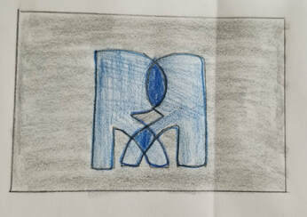
I decided that I did not need to have perfect measurements when creating this one, since it was just an experiment. In my sketch book I did this quicker so I would be able to tell if the hue contrasted well together. In this flag I did like the two 'R's the same color, with the overlapping parts being a darker blue. Although, I did not like the grey background, this made the flag as a whole look dull, this did not grab my attention. I was going to make another experiment with this design by keeping the 'R's the same color but changing the background to a blue. I decided not to make another because I had already decided I like my other design better.
|
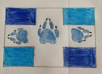
After I sketched this idea out, I thought it really emphasized my meaning, but it did not look ascetically pleasing. I liked how I used more craftsmanship in this sketch because it really helped me get the idea of what my final flag will look like. I was satisfied with he measurements and placement of the paws. The paws on this sketch did not look too big or too small for the proportion. I decided I will keep all three of the paws facing upwards so that it is appealing to the eye.
|
PROCESS
|
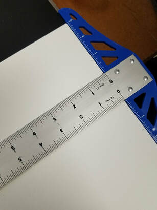
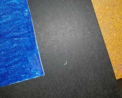
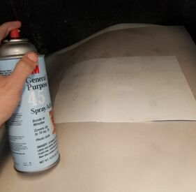
|
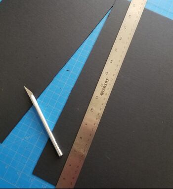
|
REFLECTION
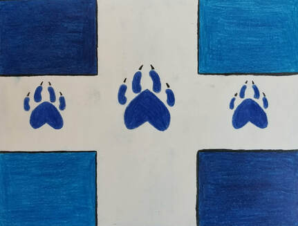
In my final flag I wish that I would have made the middle paw a little bit larger. I noticed after I was done sketching that it looked slightly smaller than I wanted, but I though the blue may make it look different against the white. Now all the paws look equal instead of having the middle one larger. I think this is a good thing that I accidentally did. The paws represent the three programs you can chose from as a junior, and I do not think one is better than the other, they are just different branches. By having the paw prints all the same size this emphasizes that the programs are all equally beneficial, it just depends on what fits you.
|
SIMILARITIES
DIFFERENCES
|

|
ACT RESPONSES
Clearly explain how you are able to identify the cause-effect relationship between your inspiration and its effect on your artwork?
Everything I had made for my flag was all used from my inspiration, from symbols to color. My inspiration was all school related logos and colors. I made sure that every meaning had been related to Ronald Reagan, MPS, or IB.
What is the overall approach the author has regarding the topic of your inspiration?
I wanted to make sure that people viewing my flag were able to see that this was apart of Ronald Reagan and their community. I knew I had to appeal to the audience of students and their families, so I made sure my flag wasn't too abstract. I figured the best way to please majority of the audience was to make my flag more geometric.
What kind of generalizations and conclusions have you discovered about people, ideas, culture,etc. while you researched your inspiration?
I found that people like to see primary colors being represented for more official things like businesses, schools, and stores. Also that symmetry is used many times to appeal to an audience.
What is the central idea or theme around your inspirational research?
Community was the central idea used in my research because I wanted to be able to express all the parts of Ronald Reagan's community.
What kind of inferences did you make while reading your research?
I decided to look for the mission statements to be able to get a central idea of what Ronald Reagan, MPS, and IB were about.
BIBLIOGRAPHY (MLA)
“Reagan IB High School / Overview.” Reagan IB High School / Overview, www.ronaldreaganhs.org/.
“Branding Guidelines.” MPS, mps.milwaukee.k12.wi.us/en/Community/News--Resources/Branding-Guidelines.htm.
Iborganization. “Logos and Programme Models.” International Baccalaureate®, www.ibo.org/digital-toolkit/logos-and-programme-models/.
“Color Wheel Pro - See Color Theory in Action.” Color Wheel Pro: Color Meaning, www.color-wheel-pro.com/color-meaning.html.
