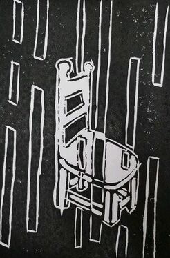
BLOCK PRINT
|
SENSITIVE
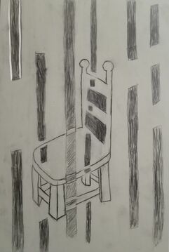
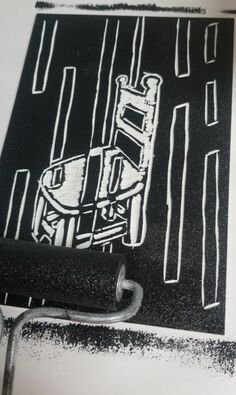
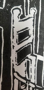
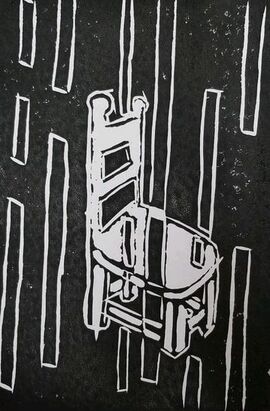
Size: 25.4cm x 17.78cm Medium: Block Print Completion: Feburary 2019 Sensitive is inspired by Francis Bacon’s, The Screaming Pope and his use of lines. My piece represents a feeling of rebellious using contrast when the vertical lines try to meet the chair. The chair remains empty to represent independence. The Man Reading by Karl Schmidt inspired me to make a piece directed towards the school system. We sit in chairs all day and rarely have a chance to express ideas or thoughts on outside topics, instead we must stay silent. |
INSPIRATION
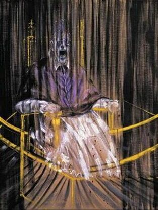
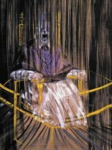
"The Screaming Pope" by Francis Bacon
|
When I first saw The Screaming Pope by Francis Bacon, the use of vertical lines and dark hues made me see this as an angry piece. With the Pope's face distorted and the lower half of his body continuing to fade away, it made me feel as though he wasn't being listened to. The lines that circle him and the vertical lines seemed as though they were telling him what to do against his will. The chair that he sits in looks as though it is restraining him to do what he wants because how his body blends into the chair and his hands looks like they are tightly gripping the chair arms. With my interpretation, this piece made me think about how the United States is called the land of the free, but we have so many restrictions in life making it feel like we aren't free at all. In school we have to stay in our seat for eight hours and if we leave for more than five minutes during class we get in trouble. We learn book knowledge more than we have debates and listen to others opinions. We get loads of homework giving us no time to go searching for new adventures. The pope's face reminds me how I feel in school, internally screaming, because I feel like I do not have a voice and I have to do every little thing right other wise I get in trouble. In my opinion The Screaming Pope perfectly expresses my emotions towards the school system. Instead of becoming an individual I am following in line with all the other robots created from school.
|
|
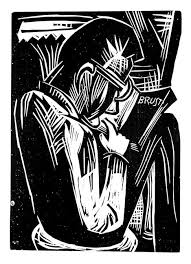
The Man Reading reminds me of a very studious man always wanting to reading and learn more. When looking at the book he is holding, it looks as though the book is closed and he is staring at the cover. This interpretation leads me to believe this man may be studious but he is drained of all the work that has been put upon him. As he sits alone he has nobody to express his emotions with, he does not even want to express his emotions to the audience, hence his back is towards the viewer. On the book you can see that "brust" is wrote onto the page, this means chest in German. I took this as a instead of that is what the man is reading about, it is what he is thinking about. That is why the rest of the page is blank because he is trying to focus but his mind keeps roaming else where. This reminds me of how I feel in school, no matter, sometimes, how hard I try to refocus my brain back onto school work, my thoughts seem to be so strong that they appear everywhere. In Schmidt's piece the man looks very calm and that is how I look on the outside. When really I become agitated and fidget, I can't sit in one spot and if I don't express my thoughts I feel like I am going to explode.
|
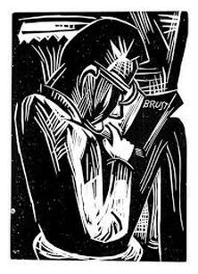
"Man Reading" by Karl Schmidt-Rottluff
|
PLANNING
|
This planning sketch was inspired by Neruda's poem, Body of a Woman. In the poem it talks about how mankind had taken advantage of mother nature. In the poem the narrator feels guilt and regret because of all the ways he had abused nature. In the poem he realizes all the bad things he did and the way he needs nature. The hourglass in the sketch represents mother nature's beautiful and delicate body. I decided to place the hour glass on a path and have a crack in the bottom to represent the ways mankind has hurt nature. All the sand that is falling out is creating a darker path showing if you keep hurting mother nature you will not have an easy path.
|
|
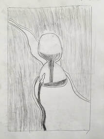
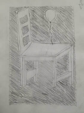
The more I grow up the more I am becoming independent and want to do things my way. Although I am still in high school I have many restrictions. The chair in my sketch represents my independence because there are no other chairs around it to be able to influence me. The balloon on the chair is a symbol of how I feel in school. I feel free and lie I can do whatever I want. At the same time this balloon is not floating away because there are many restrictions to my life right now. As my feeling of independence grows stronger the balloon stays the same. That is why the chair is so big, because I keep becoming more independent but in a way I feel like school is holding me back from experiencing new things and learning non textbook materials. If I were to follow through with this idea I thin I would make the chair a little bit smaller so it doesn't take away from the balloon.
|
|
|
This sketch was inspired by Munch's Separation painting. Instead of having two different people in my drawing I made them both me. As you can see one seems to be more sad while the other one is more free and happy. I used lines to represent emotion, the more free flowing wavy lines represent me feeling relieved of stress and anxiety. While the continuous and darker lines are trapping me keeping me sad. The more happy person is me separating from myself and not looking at my past. I used cross hatching to create a sense of irritation. I realized there were a lot of things happening in this sketch and if I were to execute it I would have to take away some of the ideas or transition them into something more simple.
|
PROCESS
|
|
|
EXPERIMENTATION
|
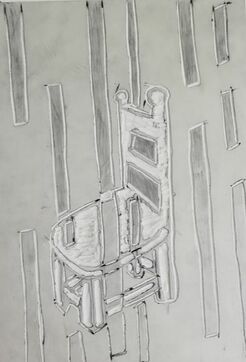
I wanted to try and express my emotions of fidgeting in my piece by not making the negative space so clean. This would then be able to be seen as if there is still a piece of me left in the chair, although I am completely gone. Once I printed the piece I realized this idea was not strong enough to get across to my audience, it would look unintentional and messy. I went back to my linoleum plate and carved out the edging of all my negative space to clean it up. After doing that the vertical lines seemed to stick out more and the chair seemed to become more noticeable.
|
REFLECTION
|
SIMILARITIES
DIFFERENCES
|
“Francis Bacon (1909-1992).” Cubism - the First Abstract Style of Modern Art, www.artyfactory.com/art_appreciation/portraits/francis_bacon.htm.
“German Expressionist Woodcuts: Karl Schmidt-Rottluff, (German, 1884-1976). Man Reading, 1921 | German Expressionist Woodcuts | Pinterest | Schmidt, Printmaking and Woodcut Art.” Pinterest, Pinterest, www.pinterest.com/pin/387872586632840978/.
|
ACT RESPONSES
Clearly explain how you are able to identify the cause-effect relationship between your inspiration and its effect on your artwork?
Before researching why my inspirations were actually made, I connected with them and had my own interpretation of the pieces. This is how I was able to create my own story through my piece by using components I felt connected with from my inspirations.
What is the overall approach the author has regarding the topic of your inspiration?
The use of line and space are very important when presenting artwork. Certain lines can represent certain feelings, like curvy lines can be seen as more free while straight lines could been seen as more stern. Positive and negative space help create how much contrast is in a piece and depending how you use them can make an artwork seem more sad or happy by the choice of them.
What kind of generalizations and conclusions have you discovered about people, ideas, culture,etc. while you researched your inspiration?
That many art pieces in the world are recreated from another art piece but can both have two completely different means. Someone can take any at work and recreate it in their own interpretation and it can still look really well done and the ideas and meaning are interesting to read one completed.
What is the central idea or theme around your inspirational research?
To try and find any artworks that looked like they were angry with the world or did seem to know who they were. This would help me be able to express the idea of being drained from school and not feeling like yourself because you are just a product of someone else instead of yourself.
What kind of inferences did you make while reading your research?
No matter the emotion you original give a piece, someone can always interpret it differently. Also, there is more likely any artwork that uses an idea from your piece and creates a contrast of your artwork. Like illustration , there can be one positive and one negative, if you make a happy piece someone most likely made a sad version o your piece.
BIBLIOGRAPHY (MLA)
“Francis Bacon (1909-1992).” Cubism - the First Abstract Style of Modern Art, www.artyfactory.com/art_appreciation/portraits/francis_bacon.htm.
“German Expressionist Woodcuts: Karl Schmidt-Rottluff, (German, 1884-1976). Man Reading, 1921 | German Expressionist Woodcuts | Pinterest | Schmidt, Printmaking and Woodcut Art.” Pinterest, Pinterest, www.pinterest.com/pin/387872586632840978/.
“German Expressionist Woodcuts: Karl Schmidt-Rottluff, (German, 1884-1976). Man Reading, 1921 | German Expressionist Woodcuts | Pinterest | Schmidt, Printmaking and Woodcut Art.” Pinterest, Pinterest, www.pinterest.com/pin/387872586632840978/.
