TRYPTIC
|
|
|
GOING THROUGH THE MOTIONS
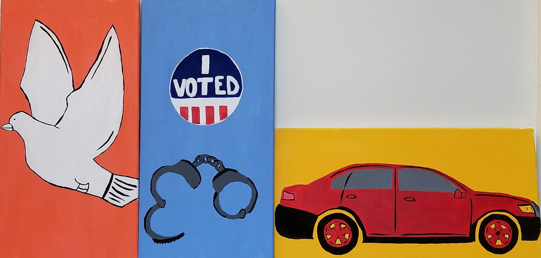
Size: 30.48cm x 60.96cm (3 canvases) Medium: Acrylic on Canvas Completion: April 2019 The vertical canvases symbolize the trapped feeling I have in society. Although I have freedom I feel as though I am only going through the motions of life. The car represents my only freedom I feel which represents my friends. They help inspire me to my future and help me not feel trapped. The position and color choices are inspired by Odilon Redon and Mark Rothko in each canvas. |
INSPIRATION

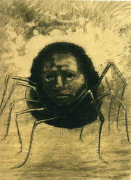
“The Crying Spider" by Odilon Redon
|
Symbolizim is meant to focus on the meanings of the forms, lines, and colors. I wanted to showcase this in my artwork because I think it is interesting to have people figure out what something means. By having people make up their own meanings I would be able to get an idea of the audiences minds and how they create things. Sometimes symbolism has a use of surrealism because it can be dreamlike. It is a chance to have the artist create their dreams and visuals they see in their head. Redon had a way of making the audience feel disturbed by the artwork. This was because of the use of combining creatures and humans. Also the work was like a dream or hallucination, this is something I admired. I really liked in this painting how the symbol took up the whole canvas and was placed in the center. I wanted to do this in my pieces so that the audience had no choice but to look at my symbol and didn't have too much to try and analyze.
|
|
I really was interested in the color field because it is different than most art. Many people would think it is boring to look at these art works because it looks so simple and like a child could make it. Although it is simple I really like the thought of the color choice. Most people look at art and get excited of the final product but don't actually appreciate all the detailed planning it takes to create something simple. There is a reason why the colors were chosen and the reason why thy were placed certain ways. I wanted to be able to use this idea of having each color in my painting have meaning to me and not just painted to look nice.
|
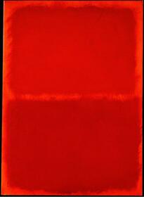
“Orange Red Orange" by Mark Rothko
|
PLANNING
|
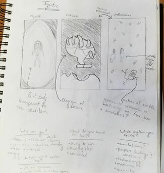
This was my first idea, of expressing my view of society. The first panel would show a body of a girl with see through skin, only showing her skeleton. This idea is meant to show that she does not have anything to make up her, as if she is just a character in a video game. Also in the corner of the panels I would have shadows to make it seem like the girl is isolated. In the second panel it would show a hand holding a brain because I feel that we do no have free will and that someone else controls us sometimes. At the end of the brain would be a pill because I feel as though we take these medicines and trust scientists and never question them, and maybe one day they might make us take one that distort what the world is actually made up of.
|
|
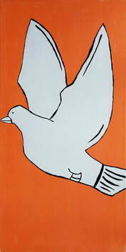
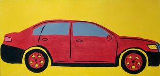
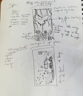
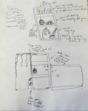
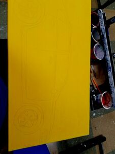
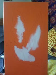
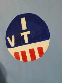
This idea I got the most excited for because I felt like I was able to really express who I am. I would have a panel with a bird to show me and my freedom, with green big plants along the boarder to show that I am very caring for the earth and that I love tropical places. Then I would have the second one be a bookcase that as books to show that I am knowledgeable, also I would have a disco ball and baby toys because I want to be able to start my own family and also have fun and party. The final would be of a car, this is to represent my friends because they drive me into my future by being apart of my decisions sometimes. My friends are my biggest influences because I hang out with them all the time and they see my true personality.
|
|
|
|
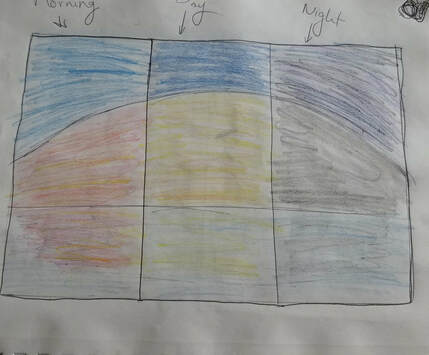
This sketch I like the multiple hues and placement of them. I thought that each panel would represent an emotion in my life that I connect to a personal experience. The middle panel would represent my everyday life because it has a mix of the darker and lighter moments. The panel on the far left would represent all my happiest memories and exciting times. The far right panel is representing my harder times in my life that I went through. I picked the sun to represent these emotions because I feel like the sun is what makes people feel more happy, with the vitamin D. Instead of having the far right panel a sun I made it a moon because I feel like many people get sad and feel alone at night time.
|
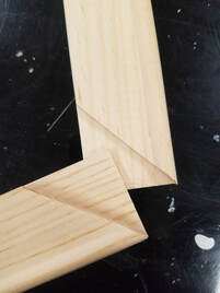
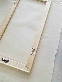
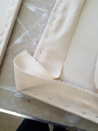
PROCESS
|
|
|
EXPERIMENTATION
|
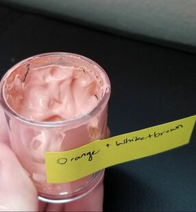
Luckily when I was mixing my colors I made the color I wanted right away for almost everything. When I was mixing the background color of orange, I wanted to make like a pastel hue. I have never made a pastel color before, I normally just buy the colors. At first I tried to just add white to the orange I already had, but it turned out more pink. I thought maybe if I wanted a more orange color I could add brown. After I added the two, it turned into a more skin tone color. I did not like the colors that would keep coming out, so I decided to just use orange color I had already.
|
REFLECTION
|
SIMILARITIES
DIFFERENCES
|
“The Crying Spider by Odilon Redon.” Curiator, curiator.com/art/odilon-redon/the-crying-spider.

“Orange Red Orange by Mark Rothko.” My Favorite Arts, theartstack.com/artist/mark-rothko/orange-red-orange.
|
ACT RESPONSES
Clearly explain how you are able to identify the cause-effect relationship between your inspiration and its effect on your artwork?
Odilon Redon's The Crying Spider effected my postion and spacing in my first and third panels. It also impacted the use of simple symbols that did not have much detail to them.
What is the overall approach the author has regarding the topic of your inspiration?
Mark Rothko made his paintings very simple and look easy to recreate. I wanted to use that idea in my panels so the audience would feel like it was super easy.
What kind of generalizations and conclusions have you discovered about people, ideas, culture,etc. while you researched your inspiration?
There are many artworks that can look very simple but not many artworks that have minimal images to it.
What is the central idea or theme around your inspirational research?
To art that used minimal images in their paintings but had a lot of meaning in the piece. Also to find art that looked very simple to an audiences eye.
What kind of inferences did you make while reading your research?
That it would be very hard to try and find inspiration in art that was meant to look easy or childlike. I knew that I would't have trouble looking for art that had a big impact though.
BIBLIOGRAPHY (MLA)
“The Crying Spider by Odilon Redon.” Curiator, curiator.com/art/odilon-redon/the-crying-spider.
“Orange Red Orange by Mark Rothko.” My Favorite Arts, theartstack.com/artist/mark-rothko/orange-red-orange.
“Color Wheel Pro - See Color Theory in Action.” Color Wheel Pro: Color Meaning, www.color-wheel-pro.com/color-meaning.html.
“Orange Red Orange by Mark Rothko.” My Favorite Arts, theartstack.com/artist/mark-rothko/orange-red-orange.
“Color Wheel Pro - See Color Theory in Action.” Color Wheel Pro: Color Meaning, www.color-wheel-pro.com/color-meaning.html.
