SELF PORTRAIT

|
GREY SEAL
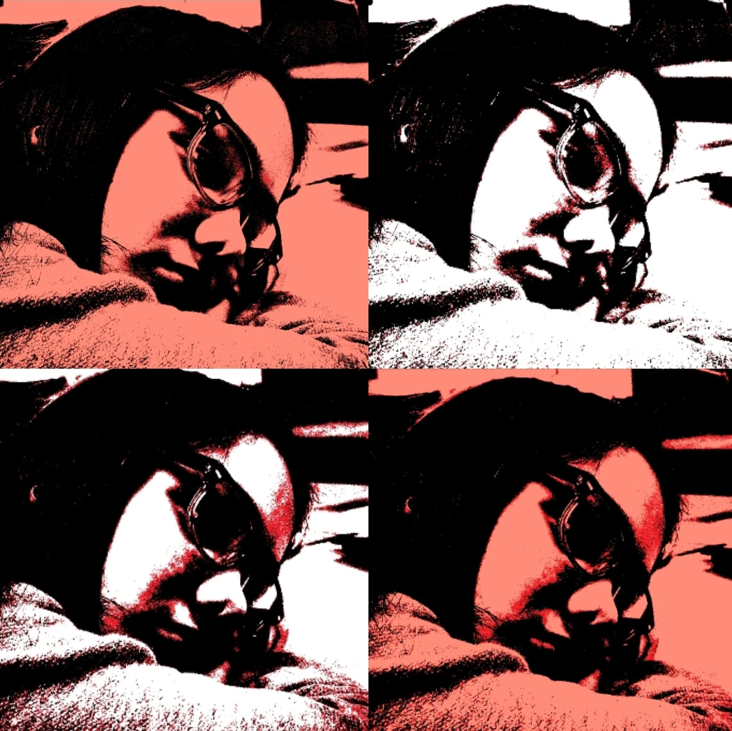
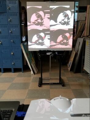
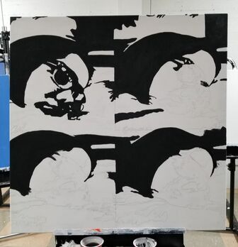
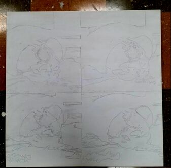
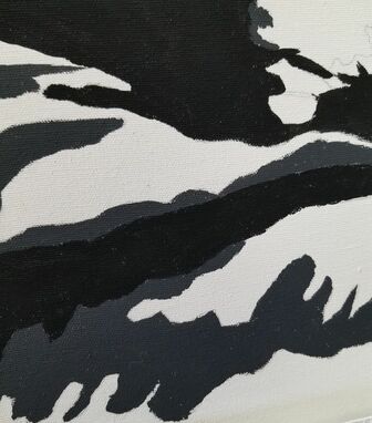
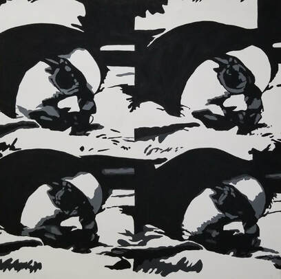
Size: 91.44cm x 91.44cm Medium: Acrylic on canvas Completion: March 2019 Grey Seal expresses my feelings towards the education system, inspired by Elton John's song Grey Seal. His song uses metaphors representing a bad education as a kid. I don't feel that students are able to express their ideas freely, instead they are either right or wrong with no in between, hence the use of only black and white. Andy Warhol's use of repetition inspired me to create a 2 by 2 grid, representing the 4 years of high school. Each image has a different set of shading and contrast representing the different experiences each year of high school.
|
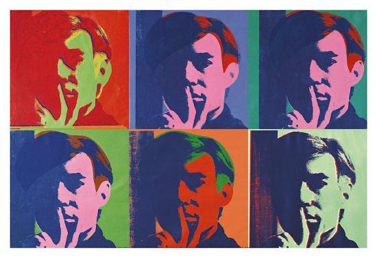
INSPIRATION

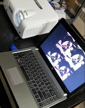
“A Set of Six Self-Portraits" 1967 by Andy Warhol
|
I always admired Andy Warhol's high contrast portrait paintings because it makes the audience have a hard time trying to figure out what the picture exactly is. If the contrast and shadowing are super high then the piece will start to be interpreted as what the view wants. Adding color makes the picture easier to see and while I like that in A Set Of Six Portraits, for my piece I would not use color to make it harder to see the facial features. In many of Warhol's self portraits he exaggerated his facial features to look more comic. He did this by disguising himself by his clothes or hair. In his earlier works, when he first started to use repetition it was more of an experimentation. Using this technique I would be able to test different amounts of contrast and shadows.
|
|
Until I started researching more on high contrast and high shadowing pictures, I never really realized that Elton John's album cover was very high in both. I instantly loved the idea of him not having a second half of his face. Especially with the use of his glasses, it made the audience not be able to see the detail of his eyes or eyebrows. I knew I would have to place my head a certain way in order to create shadows on one side of my face. Originally I was going to take a picture without my glasses, but after seeing Elton John's album cover I decided to keep my glasses on so it would make more of my facial features less detailed.
|
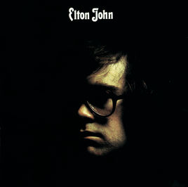
Singer/Songwriter, Elton John, album cover "Elton John"
|
PLANNING
|
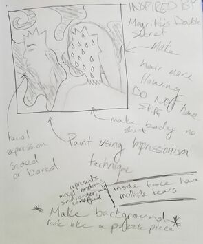
When I took art history I was introduced to a new painting technique, impressionism. I really like how it was able to capture the movement in a picture. I also liked the meaning behind surrealism paintings. I wanted to combine my two favorite painting styles into my self portrait as a way for people to get to know me. I was inspired by Rene Magritte's The Double Secret because I liked how the face was separated from the head. Inside the head I was going to have it filled with tears. The tears are a symbol of all my emotions, not just sad, but angry, confused, anxious. I wanted my face to look bored because I feel like that is how people see me and never really know what is going on in my mind.
|
|
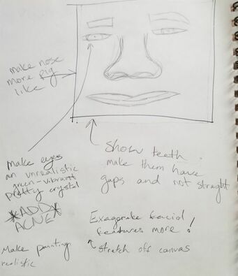
In this sketch I wanted to make all my facial features very large and exaggerated. I do not want the audience to focus on anything else in my piece because society only cares about how a person looks. I would then make all the sizes of my features based on what others have said about me. I will make my nose the biggest out of all my features because many people comment on my nose. In the past people would always make fun of it saying it looked like a pig. As I grew older I stopped caring what people think because they would also say nice things like how pretty my eye color was. So I will make my eyes an unrealistic green color. When I am done with this piece I want people to look at it and think to themselves that nobody truly looks like that. The reason I am doing this is because people's comments and ideas most times have an affect on a person and how they see themselves.
|
|
|
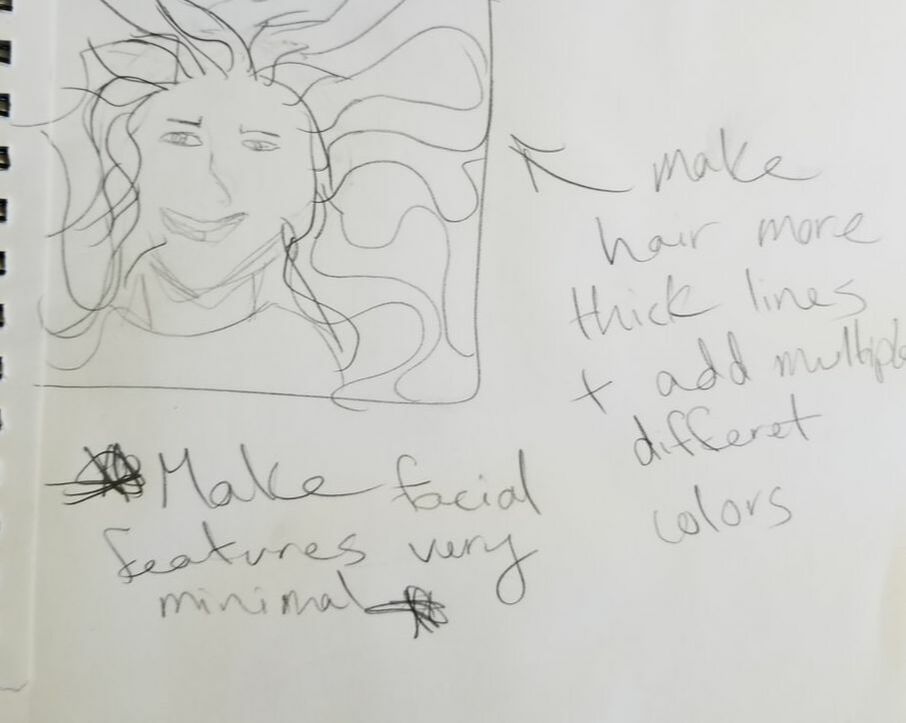
In my final I wanted to make my hair super colorful and crazy. I was going to do this by having thick bold lines to capture the movement in my hair. The lines would be clean like propaganda and move like impressionism. The hues would have high contrast to each other. For my face I would make all my facial feature minimal so that it does not take away from the hair, also so that it is not to much to look at for the audience. This idea came from how people view you, like in my second sketch. I said the people's comments affect how a person can see them self. People always comment on my hair being so soft and shiny or even frizzy. With all the comments on my hair it feels as though sometimes people forget that there are other things that make up my physical self.
|
PROCESS
|
|
|
EXPERIMENTATION
|
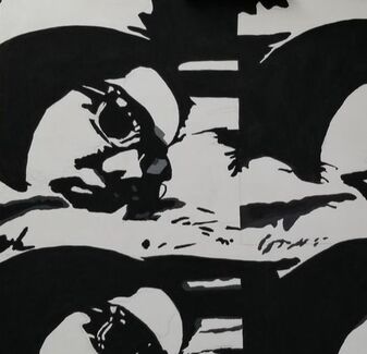
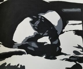
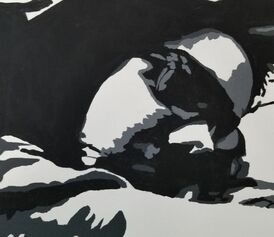
These are the bottom two images from my grid. Here I made high shadows in both of these so that is was hard to see my mouth and nose. Although I liked both of these images I preferred the one on the right side because the shadows were stronger. Making the shadows stronger it made it harder for the audience to tell where my mouth is or where my nose starts. The use of shadows worked very well in the image as well because it made the it hard to see where my face ended and that my head was resting on my arm.
|
|
|
|
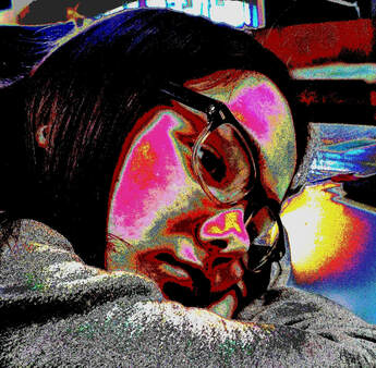
While I was in the Pop Art Photo Editor app I experimented around with the filters. This was able to give me ideas on how my painting would look like if I painted it multiple hues. I liked the vibrant hues on my face because it made it seem unrealistic. Also, these hues make a person feel excited and fun, and I thought it was ironic that they were on my nonchalant face. Although I liked the meaning I could use behind this filter, I did not like that the shadows were not dominate enough. With all the different hues being used it made my facial features more easy to notice.
|
REFLECTION
|
SIMILARITIES
DIFFERENCES
|

“Elton John by Elton John.” Apple Music, 10 Apr. 1970, itunes.apple.com/us/album/elton-john/485503624.
“A Set of Six Self-Portraits, 1967 Art Print by Andy Warhol.” Art.com, www.art.com/products/p8765095448-sa-i9954162/andy-warhol-a-set-of-six-self-portraits-1967.htm.
|
ACT RESPONSES
Clearly explain how you are able to identify the cause-effect relationship between your inspiration and its effect on your artwork?
In my inspirations I was able to really use the idea of high contrast and shadows. This idea made me execute my straight lines and smooth painting throughout my piece.
What is the overall approach the author has regarding the topic of your inspiration?
High in contrast and repetition was key to Andy Warhol's artworks. Each new image on an artwork was a type of experimentation. He used the same image but would change the hues or the hues would change after printing so many of the same image because the ink would fade.
What kind of generalizations and conclusions have you discovered about people, ideas, culture,etc. while you researched your inspiration?
Ideas can be transferred from medium to medium, as seen in my inspiration. Both used high contrast and shadows in the piece, but one was a painting while the other was a picture for an album cover. The ideas in art can be universal, it is not just in paintings but in music videos and movies.
What is the central idea or theme around your inspirational research?
Finding artworks that are hard to tell the difference in facial features and not having any blending. I wanted to make sure that it was difficult for the audience to understand what was going on in the image.
What kind of inferences did you make while reading your research?
It seems that as artist continue in their career that sometimes they lose really good strategies and techniques they used to use. Sometimes this is a good thing because they find better techniques but sometimes it is a bad thing because they forget how good of an artist they are and get stuck on using the same techniques that can get boring after time.
BIBLIOGRAPHY
“A Set of Six Self-Portraits, 1967 Art Print by Andy Warhol.” Art.com, www.art.com/products/p8765095448-sa-i9954162/andy-warhol-a-set-of-six-self-portraits-1967.htm.
“Elton John by Elton John.” Apple Music, 10 Apr. 1970, itunes.apple.com/us/album/elton-john/485503624.
Tate. “What Was Andy Warhol Thinking? – Look Closer.” Tate, www.tate.org.uk/art/artists/andy-warhol-2121/what-was-andy-warhol-thinking.
“Elton John by Elton John.” Apple Music, 10 Apr. 1970, itunes.apple.com/us/album/elton-john/485503624.
Tate. “What Was Andy Warhol Thinking? – Look Closer.” Tate, www.tate.org.uk/art/artists/andy-warhol-2121/what-was-andy-warhol-thinking.
