MIAD: IMAG(E)INE
|
|
XENOPHOBIA
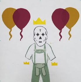
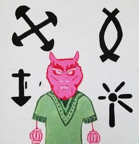
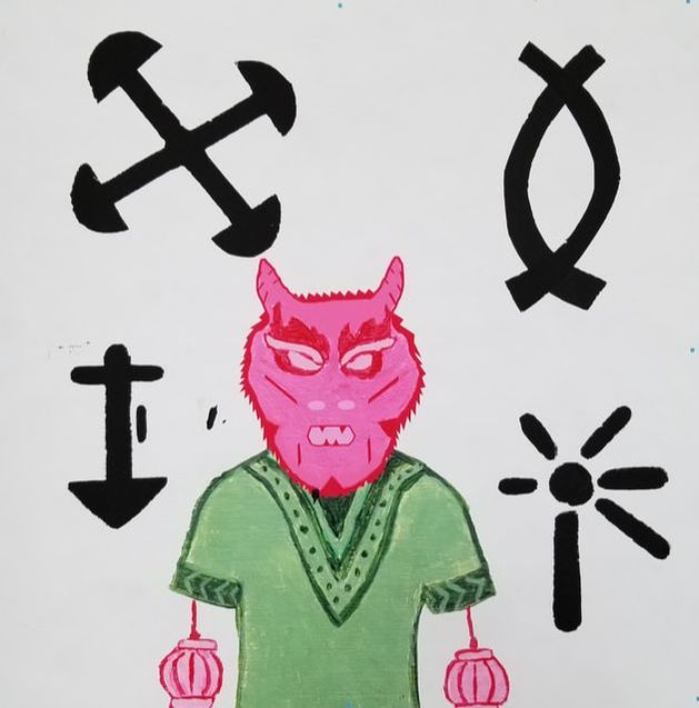
Size: 91.44cm x 91.44cm (2 tyvek papers) Medium: Mixed Media (Acrylic on Chip Board, Digital Manipulation & Silk Screening) Completion: November 2018 Xenophobia conveys my perception of Milwaukee’s community because of its segregation. One tyvek represents Milwaukee’s South side, showing German and Latino culture while the other shows Milwaukee’s North side; African American and Asian culture. I grew up around diversity having many cultures celebrated together, which is my vision of Milwaukee. The city’s flag inspired my use of demographics in my art. Monster by the Couto Brothers inspired the use of combining different cultures in one piece.
|
INSPIRATION

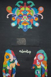
"Milwaukee Monster" by The Courto Brothers
|
Every summer I ride my bike around the city of Milwaukee, riding gives me a chance to appreciate the art around me. Many people do not notice the multiple murals around the city, but every time I ride along water street the Milwaukee Monster catches my attention. My first impression of this mural was a person being trapped by society. The hues made me feel this person is very creative because they are full of a mix of warm and cool colors. The lines and shapes within the face and hands gave me the impression this person is restricted to themselves. As I did more research on this mural I found that the Couto Brothers made this mural about native cultures' masks by using their interpretations. This inspired me to show diversity by mixing the cultures into one person. In Milwaukee Monster The Couto Brothers used many different hues but only in the face and hands of the mural. The background was a solid black. I figured this was meant to be so the person would have a contrast against the background. I thought this was ascetically pleasing because having the contrast made the person stand out more to the viewer. This is something I wanted to incorporate into my piece as well. I figured I would be able to have my stencils and paintings colorful while my background is either a white or black solid color. If I do this I will be able to show a contrast like the Couto Brothers did in Milwaukee Monster.
|
|
Within my research I found, worldpopulationreview.com/us-cities/milwaukee-population/, this gave Milwaukee's demographics breakdowns. They stated the top four racial groups being 44.8% White, 40.0% African American, 17.3% Hispanic or Latino, and 3.5% Asian. It also stated that 21% claimed German ancestry. Because of these demographics I wanted to split up 2 racial groups on one tyvex and the other 2 racial groups on my second tyvex. I tried to stay away from using religious celebrations, because that suggest any racial could celebrate it, instead I stayed more to celebrations originated by those cultures. This inspiration came from Milwaukee City's flag because they used Milwaukee's history. The people in Milwaukee do make up Milwaukee's history because without the settlers there would be no city. I liked how in the flag each color, shape, or line had a specific meaning behind itself. I wanted to use that in my piece, whether it was a symbol, item, or face. Each thing I put on my tyvex I would have it's own meaning but still be put together as one.
|

The People's Flag of Milwaukee, "Sunrise Over the Lake" by Robert Lenz,
|
PLANNING
According to WUWM 89.7 Milwaukee's npr, "Milwaukee [is] still [the] country's most segregated metro area". Growing up I had a vast majority of minority friends, because of them I learned about many different nationalities. This is what leads my perspective of Milwaukee's community as a diverse city. Creating this piece I want the audience to see the mixed cultures as one by taking celebrations from different cultures. Since I will be creating two 36cm x 36cm silk screens, I decided to split them up by demographics to represent the segregation in Milwaukee.
|
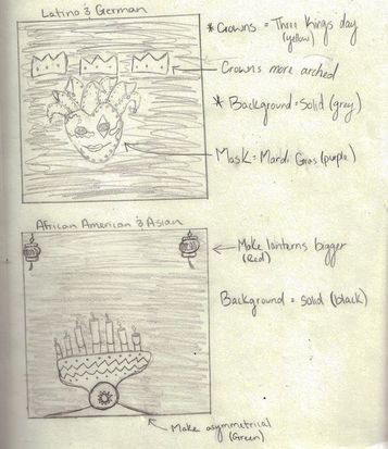
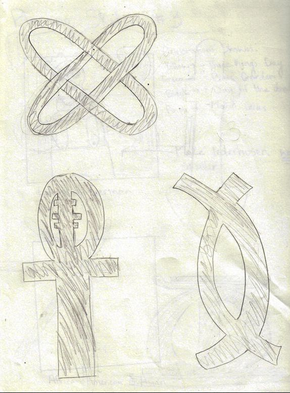
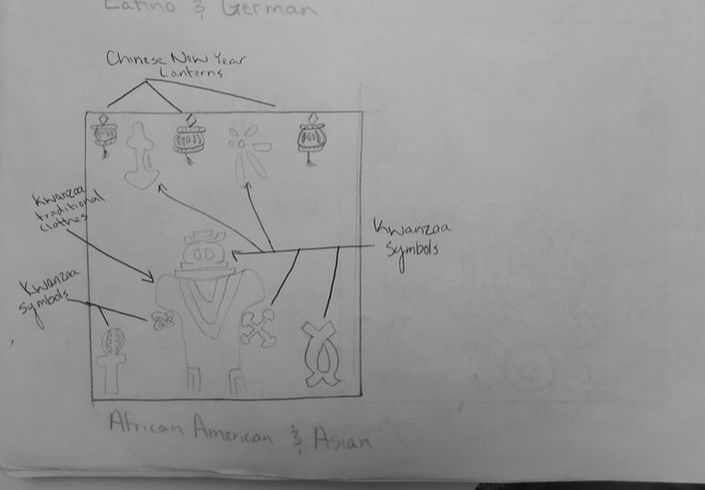
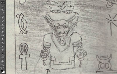
You can see I intended combining culture celebrations when I sketched the Kinara, from Kwanzaa celebration, in the center of my piece. I liked the idea of having the Kinara in the center with Chinese New Year lanterns hanging down from the top sides of the corners. The more I looked at the sketch I did not like how they were not combined together. Yes, they are on the same drawing but there is no mix, it still felt segregated because there was too much negative space. On my other sketch of my second tyvex, this one felt more mixed because the objects were closer together, not having as much negative space in between them. It was supposed to as if the Mardi Gras mask was wearing the crown but I would have to subtract some elements from the mask to be able to do so, because the mask already has a sort of crown coming from the head. I did like the idea of having a head on my piece, I felt as though the audience would be able to connect more to my piece if they see a face, since it is something we all have.
|
|
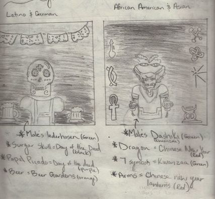
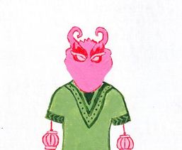
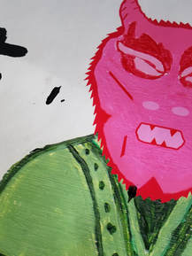
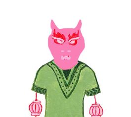
After drawing my first sketches I knew I wanted my final product to have faces on both tyveks. Instead of having a floating head I decided to not only use faces but a whole body on the center of both tyveks. To make the audience feel as though that the cultures are together I did not make hands for the people but used items from the other celebrations. I made one tyvek have a dragon head and Chinese new year lanterns wearing a dashiki from Kwanzaa. Along the sides I would make the symbols from Kwanzaa as stencils. After looking at the sketch I didn't like that there was more use of Kwanzaa than Chinese new year. I wanted both celebrations to have equal weight. This showed in the Latino and German tyvek, I made the body wearing a lederhosen with arms of beer, and the top half of the tyvek Latino community. Although this was more combined than my last sketch I didn't like that I used horizontal symmetry because it made the communities still segregated.
|
|
|
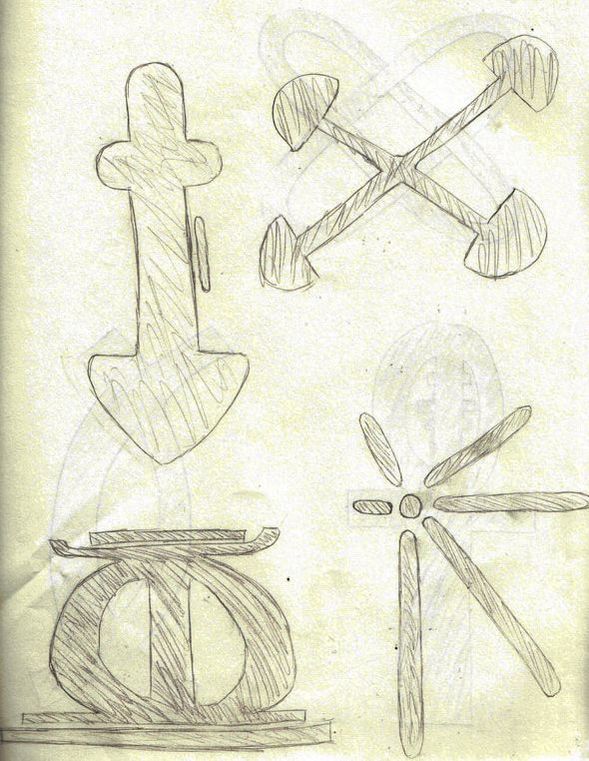
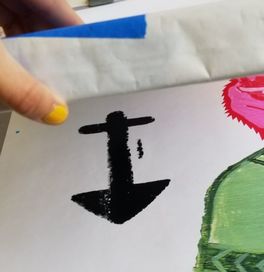
I knew I wanted to use the symbols from Kwanzaa on my tyvek but I did not want to use all seven, because I was afraid it would look to crowded on my tyvek. I drew all seven symbols out so I would be able to see which symbols look the best larger. None of them looked bad to me so instead I ended up finding the meaning of each one. I picked the top four I thought fit my perspective of Milwaukee and diversity. The four I ended up using were: Purpose, Creativity, Collective Work and Responsibility, and Cooperative Economics. In each definition these four symbols had they all said something about community and being together, which was one of the reasons I picked these ones. Picking ones that talked about being together helped emphasize my meaning of diversity in my piece.
|
|
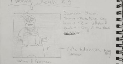
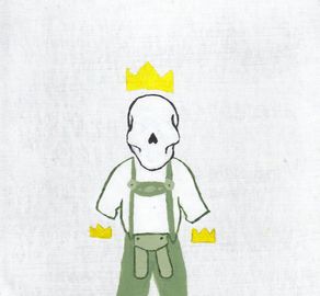
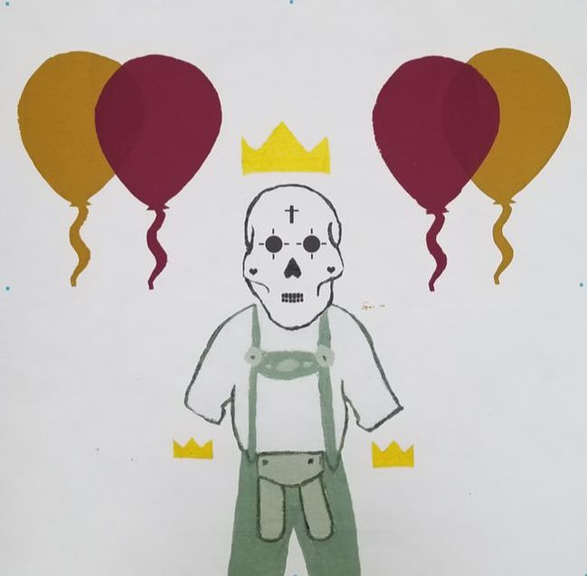
In the Latino and German planning sketch I liked the idea of having the three crowns to represent Three Kings Day, which was also attached to the the body of a sugar skull wearing a lederhosen. The sugar skull represented Day of the Dead and the lederhosen represented German celebrations in overall. I liked all three of these together because the it shows off some specific culture celebrations like, Day of the Dead and Three Kings day, but it also showed off generalized celebration, like the lederhosen, which is worn when going out to celebrate any party or to even go to a beer garden. Instead of having beads around their neck to represent Fassenacht, I thought of using balloons instead because in Fassenacht they have many floats and balloons. I figure I would use a dark red and yellow hue for the balloons. Many people know Fassenacht as German's Mardi Gras, and Mardi Gras colors are assosicated with yellow, purple and green. Also having the bead necklaces would not be as noticeable has the balloons would be, making the German culture seems smaller than the Latino culture.
The African American and Asian tyvek I tried experimenting with looks in my planning sketch. I tried experimenting by instead of having an actual face has the head I used one of the symbols from Kwanzaa. Although I liked the idea of having a Kwanzaa culture body in a Chinese New Year background it made them not seem as together because the person only made up one culture. Also having the symbol has the head made it seem like Kwanzaa was more important than the Chinese New Year because that is what only made up the body. Seeing all the symbols used at once was crowded and not enough negative space. I decided I was going to keep the idea of the dragon head and the lantern arms wearing a dashiki, and use the four symbols listed from above, in my final piece.
|
|
PROCESS
|
|
|
EXPERIMENTATION
|
After finishing my sketches I really liked all the components that made up the dragon body. I scanned my sketch and uploaded it into Photoshop, then used the lasso tool to crop just the dragon from the other part of the sketch. I put this sketch onto a new white background and centered it to have symmetrical balance. Then I used the paint tool to try and color in the dragon body as if it wear from a coloring book. This did not work because the colors were to smooth an did not have texture to them. Also I was unable to color in such small spaces and get the fine details I wanted within the dashiki. If this sketch was more precise and had reflective symmetry to itself I would have liked it better but since the sketch was not equal it made the whole drawing look unbalanced on the background.
|
|
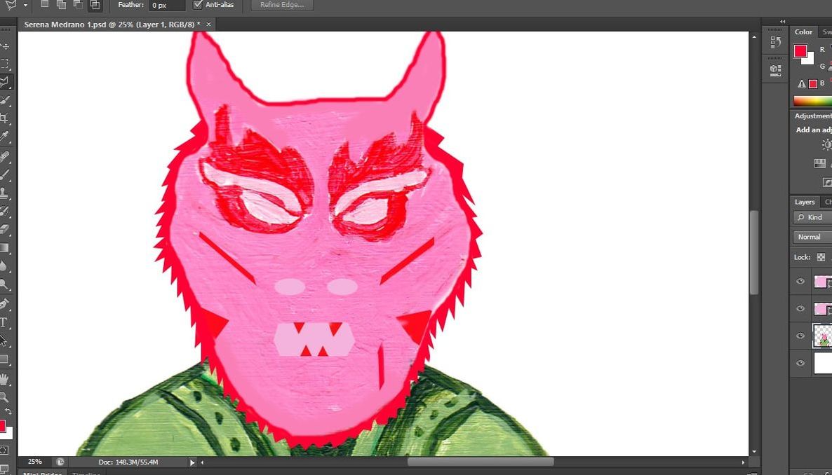
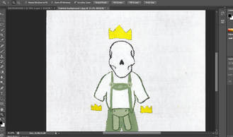
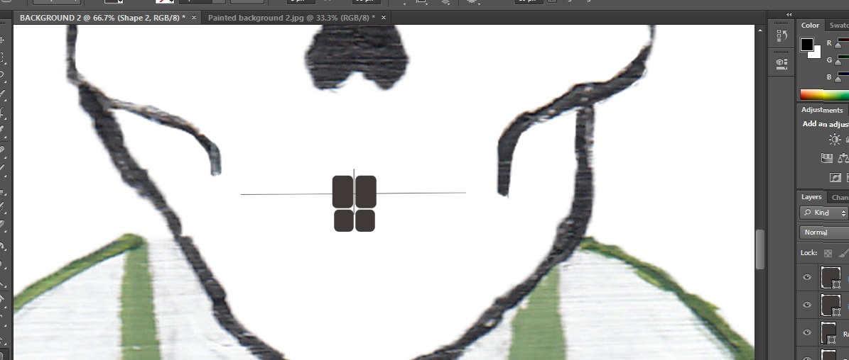
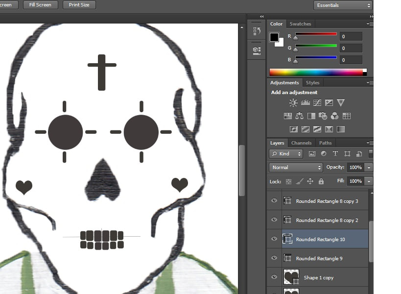
After I painted the dragon body using acrylic on chip board, I scanned my image and pasted it to a new white background in photoshop. This dragon body did not have facial features, until I added them in photoshop. After adding the facial features I noticed I did not like the contrast that showed from the acrylic paint to the facial features. I tried to make the contrast of the two different textures go away by using the paint tool and coloring in the whole head of the dragon. After doing painting the head in photoshop I realized I created the same problem with the contrast from the dragon head to the dashiki. If I were to continue this process and make the texture contrast go away with everything the viewer would no longer be able to tell I painted with acrylic in the first place.
|
|
|
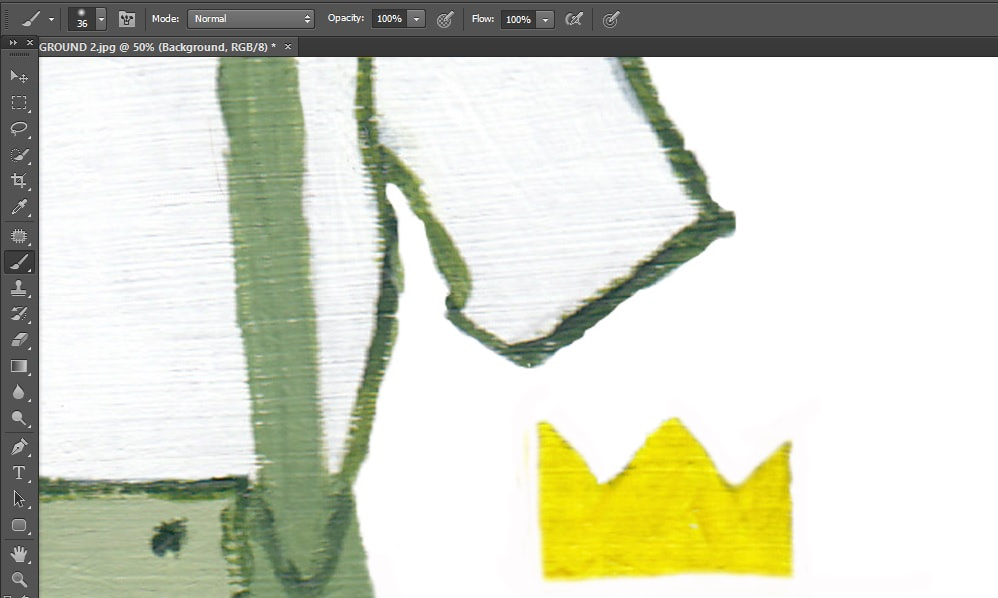
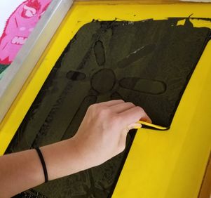
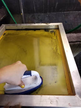
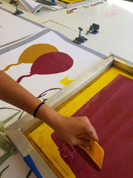
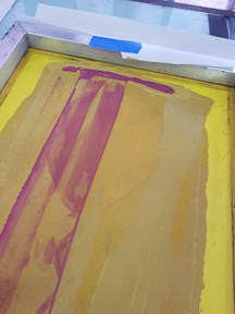
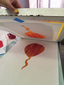
When I started pulling my stencils onto my tyvek I tested on a newspaper how the balloon for my Latino and German tyvek, would look like if I mixed colors. Instead of having them layer on each other I used both paints and pulled them at the same time. Although I liked how this balloon looked, I realized, if I were to use this same technique on two balloons and layer them onto each other there would be no contrast. If I had no contrast between these two balloons the viewer would not be able to easily see that these are two separate balloons.
|
|
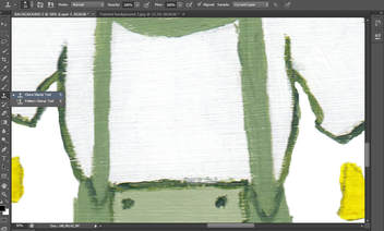
I found a new tool, clone stamp, and it seemed like it would be useful to make my edges cleaner and thinner. This would be useful because some of my edges from the acrylic paint were not as straight as I wanted or were thicker than the line next to it. Clone stamp seemed like it would fix this problem because I could fill the tool with the any color I click on from my piece and use it like a paint brush. When clone stamp was applied it was not as solid as I hoped, it was more like the tool had a faded filter over it (you can see this on the right part of the waist). This would not have worked for my final piece because it would look like things did not print fully and would make some parts too hard to see.
|
REFLECTION
|
SIMILARITIES
DIFFERENCES
|
“Your Guide to Milwaukee's Street Art.” Milwaukee Magazine, 16 Jan. 2018, www.milwaukeemag.com/guide-milwaukees-street-art/.

Spicuzza, Mary, and Ahmed Elbenni. “Will the City of Milwaukee Get a New Flag? The Common Council Sends the Issue to the Milwaukee Arts Board.” Milwaukee Journal Sentinel, Milwaukee, 19 July 2018, www.jsonline.com/story/news/politics/2018/07/19/city-adopt-peoples-flag-milwaukee-its-official-flag/799842002/.
|
ACT RESPONSES
Clearly explain how you are able to identify the cause-effect relationship between your inspiration and its effect on your artwork?
After researching and finding out that the Couto Brothers used their interpretation of cultures' masks, it led me to show case my interpretations of Milwaukee's community by mixing cultures' celebrations making my piece very diverse.
What is the overall approach the author has regarding the topic of your inspiration?
Many people first look at Xenophobia and are very confused and on what everything means, like when they look at Milwaukee's Flag. Everything that is place on Milwaukee's Flag as some meaning and reason for being on the flag. I used that as inspiration so when the audience reads further into detail about all the symbols and metaphors used in my piece, it brings more meaning and understanding to Xenophobia.
What kind of generalizations and conclusions have you discovered about people, ideas, culture,etc. while you researched your inspiration?
Having high contrast makes one part more eye catching than another, whether it be contrast in texture or hues. I used this to my advantage when trying to separate the cultures by using different hues. I also found that the contrast in texture can make a big difference it what catches the audiences eye first.
What is the central idea or theme around your inspirational research?
Showing my interpretation of Milwaukee's community, how diverse I feel it is but also how I am aware of the large segregated city we live in. Just like how the Couto Brothers used diversity by combining the masks into one, I wanted to show a very diverse piece that had people of different cultures celebrating together.
What kind of inferences did you make while reading your research?
Most times we try and make our own meaning of a piece, so we can try to understand something ourselves. As we read more into the piece we can find that we might have interpreted the piece completely opposite or there is more meaning than the the audience was aware of. Like when I first saw Milwaukee Monster, I interpreted it different than what it actual was, and when I saw Milwaukee's Flag there was more meaning behind all the shapes and hues.
BIBLIOGRAPHY
“The History, Principles, and Symbols of Kwanzaa · InterExchange.” InterExchange, www.interexchange.org/articles/career-training-usa/history-principles-and-symbols-of-kwanzaa/.
“Milwaukee, Wisconsin Population 2018.” Total Population by Country 2018, worldpopulationreview.com/us-cities/milwaukee-population/.
“Your Guide to Milwaukee's Street Art.” Milwaukee Magazine, 16 Jan. 2018, www.milwaukeemag.com/guide-milwaukees-street-art/.
“Symbolism.” The People's Flag of Milwaukee, milwaukeeflag.com/symbolism/.
Spicuzza, Mary, and Ahmed Elbenni. “Will the City of Milwaukee Get a New Flag? The Common Council Sends the Issue to the Milwaukee Arts Board.” Milwaukee Journal Sentinel, Milwaukee, 19 July 2018, www.jsonline.com/story/news/politics/2018/07/19/city-adopt-peoples-flag-milwaukee-its-official-flag/799842002/.
Lecci, Stephanie, and Michelle Maternowski. “Ranking: Milwaukee Still Country's Most Segregated Metro Area.” WUWM, www.wuwm.com/post/ranking-milwaukee-still-countrys-most-segregated-metro-area#stream/0.
“Chinese New Year Symbols – Dragons, Lions, Guardian Figures... – Kiinalainen Uusivuosi.” Kiinalainen Uusivuosi, 10 July 2017, kiinalainenuusivuosi.fi/en/chinese-new-year-symbols-dragons-lions-guardian-figures/.
